Blue NovaLink
Visual Identity, Custom Typeface, Illustration, Website
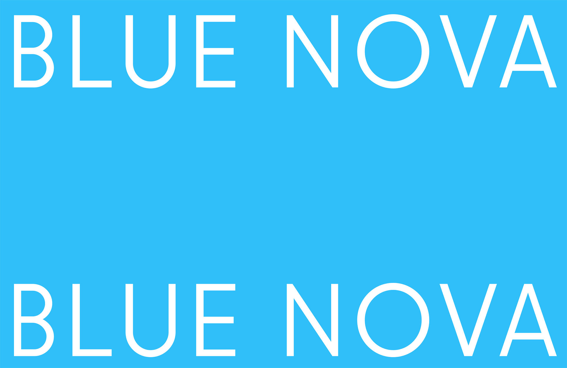
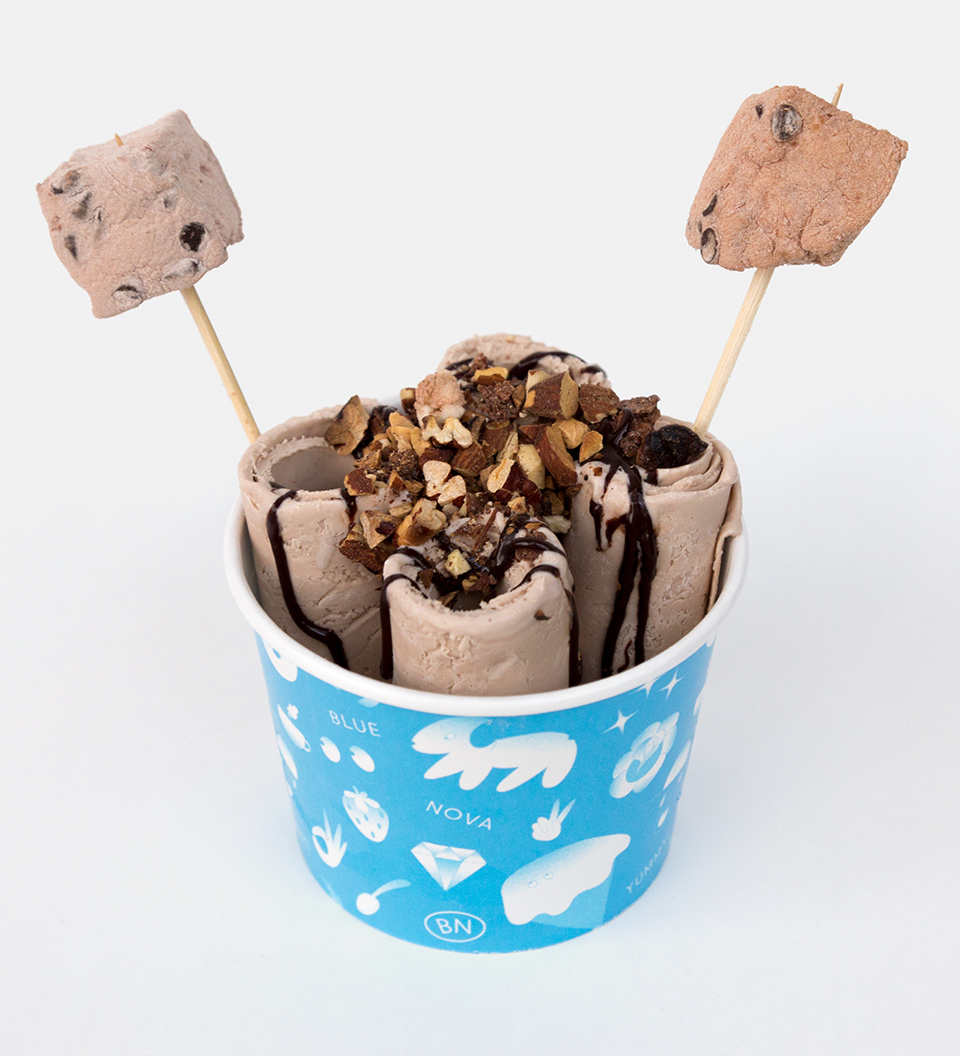
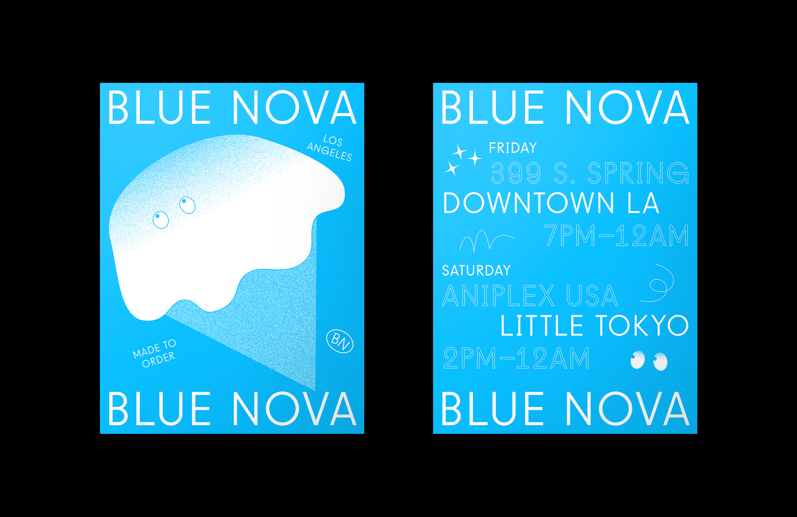
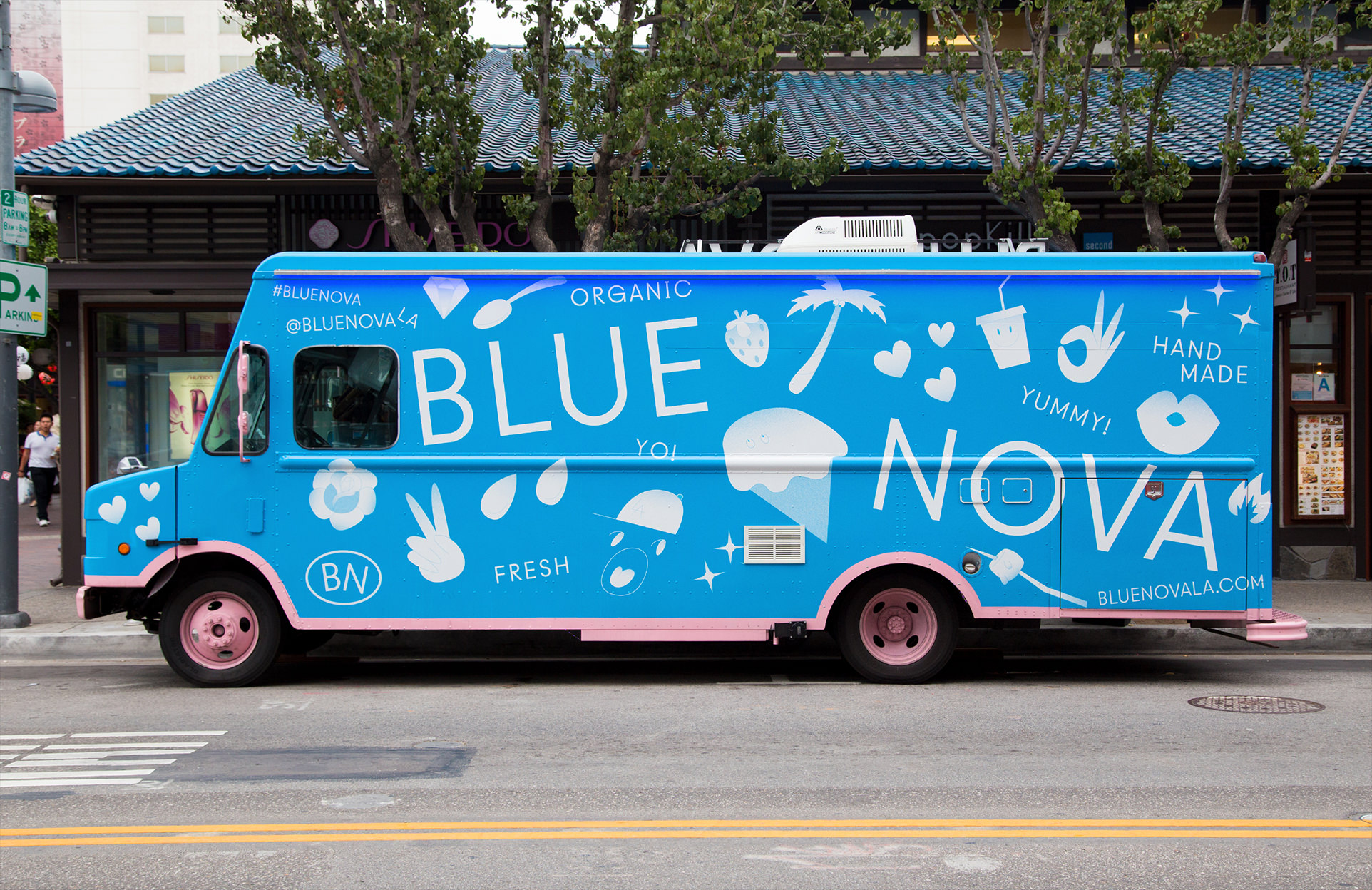
Blue Nova is a dessert truck located in downtown Los Angeles. As the first truck to serve made-to-order ice cream rolls, I wanted to create a bold and youthful brand identity with an emoji-like illustration style. A custom geometric typeface was also created to serve as a contrast to the looseness of the illustrations.
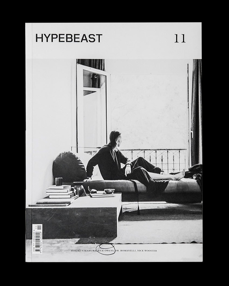
HYPEBEAST
Logo Design, Lettering
HYPEBEAST is a media company that covers street fashion and hip-hop culture. As a part of the magazine redesign by Number 04, I was asked to update the wordmark, which is now used across all of their print and digital properties. In addition to the main wordmark, I extended the custom logotype to their online store, HBX.
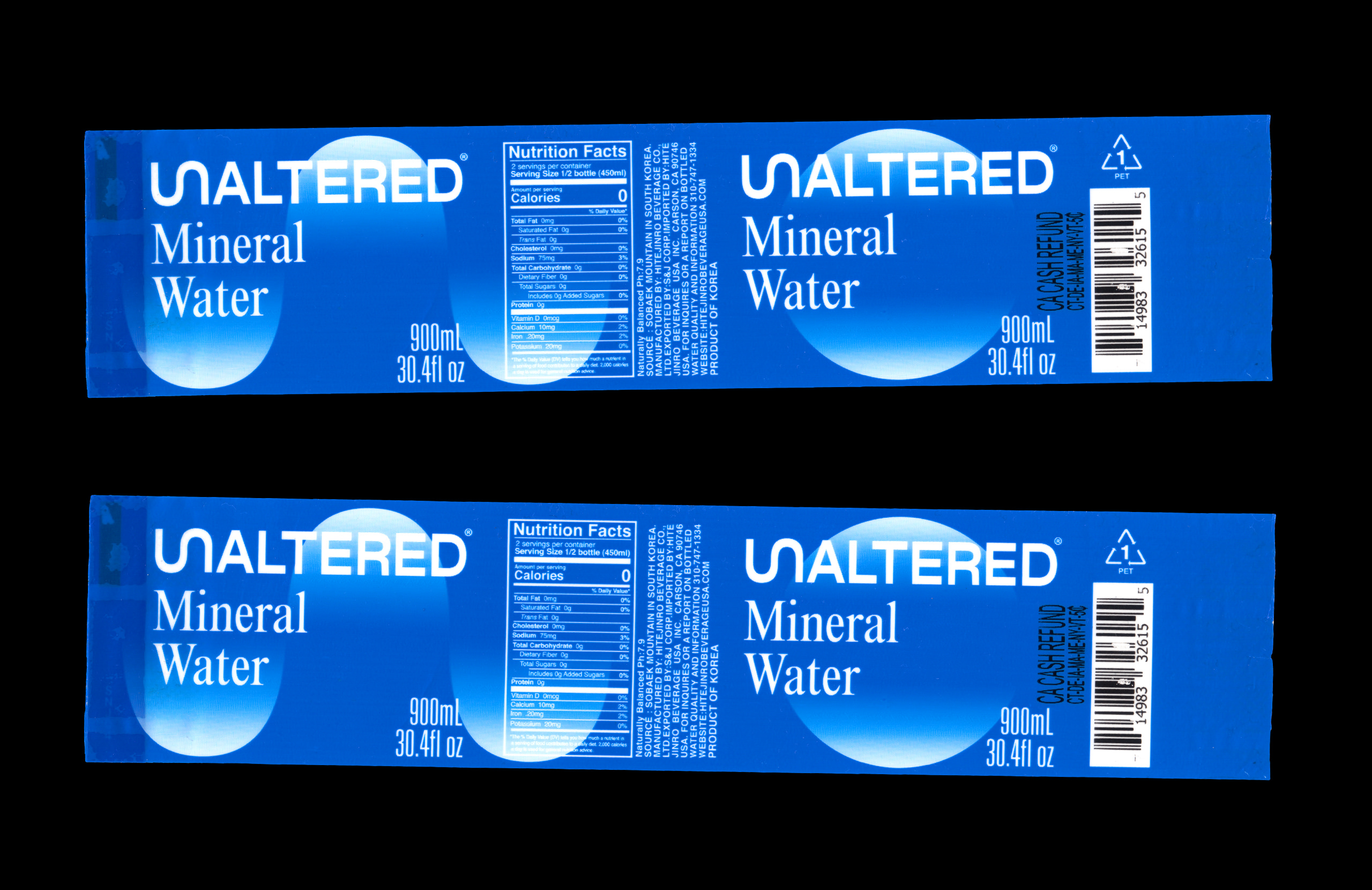
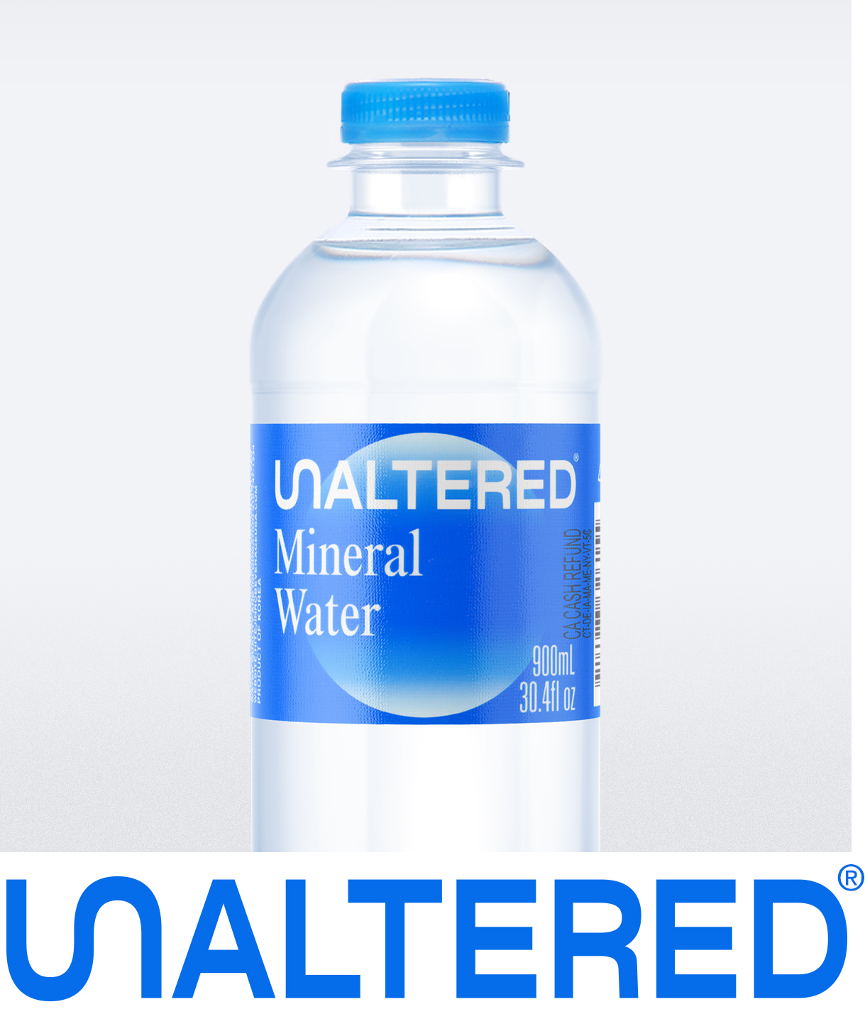
UNALTERED
Naming, Visual Identity, Packaging
UNALTERED is a mineral water company with their water coming from beneath the Sobaek Mountains of South Korea. With an already established presence under a different name in Korea, I was brought in to help name and create the identity for their expansion into the US market.
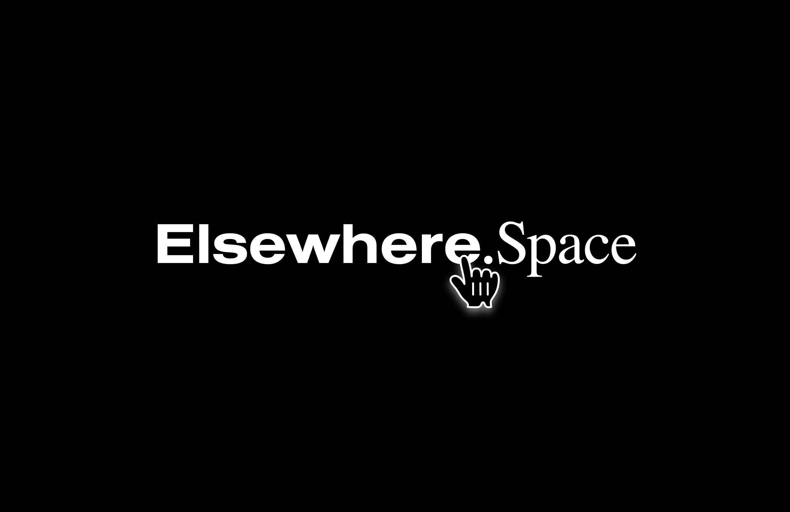
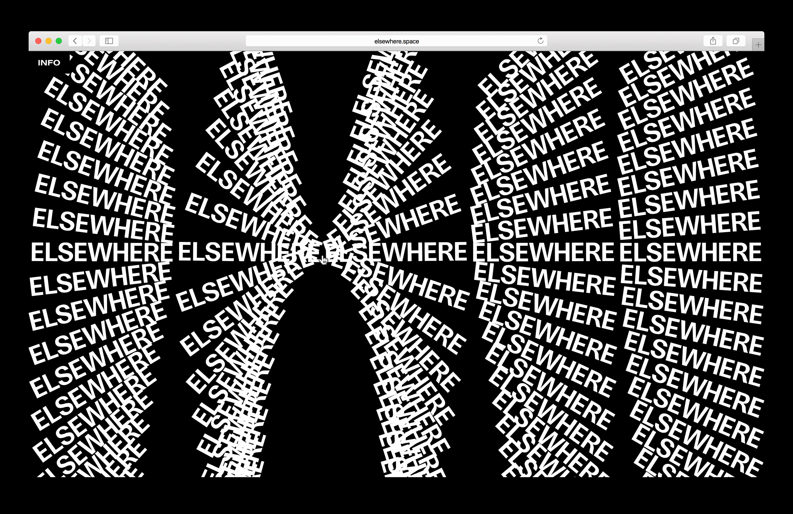
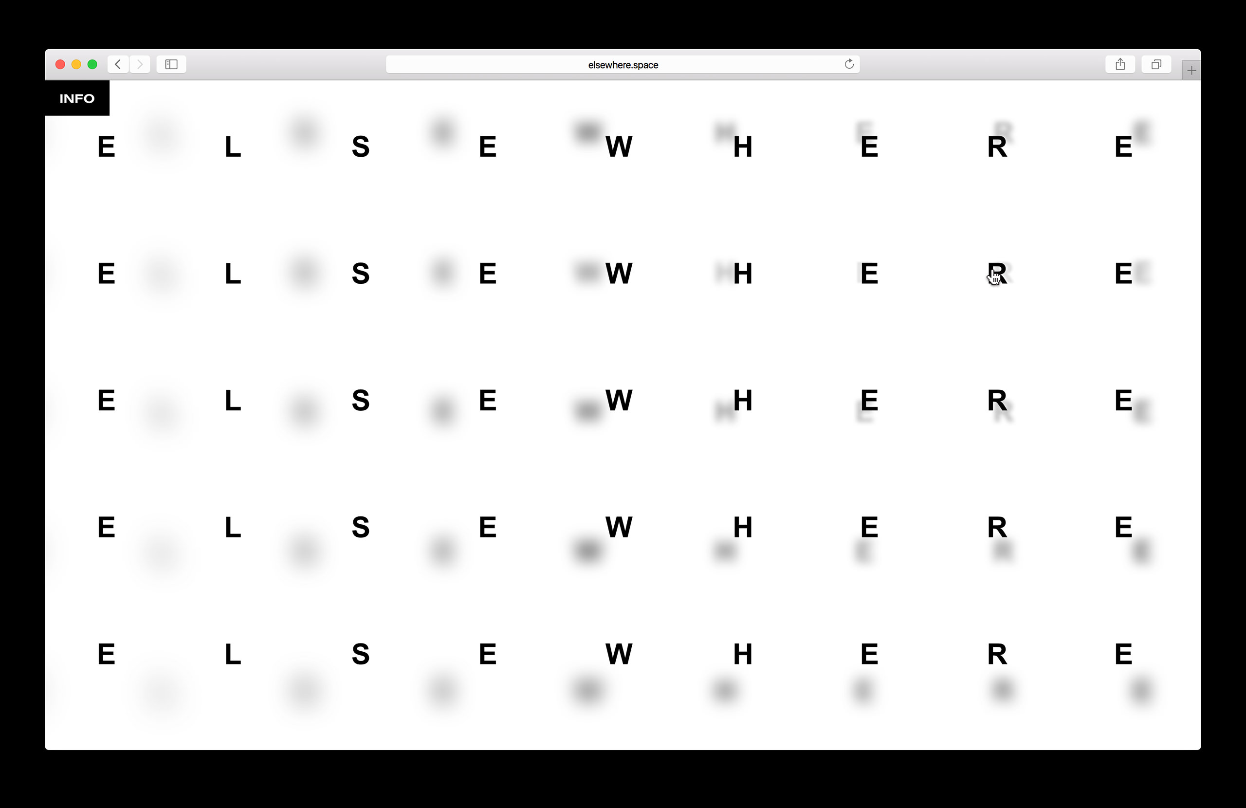
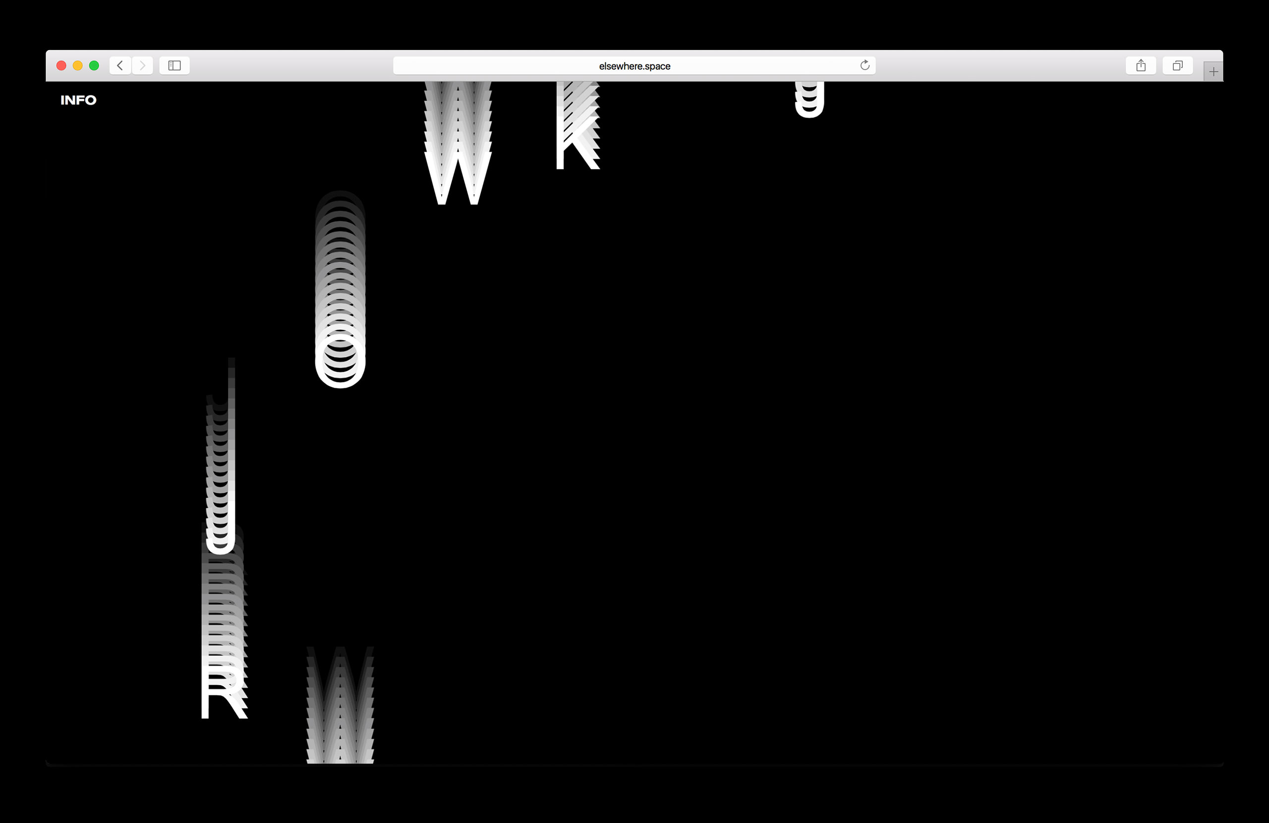
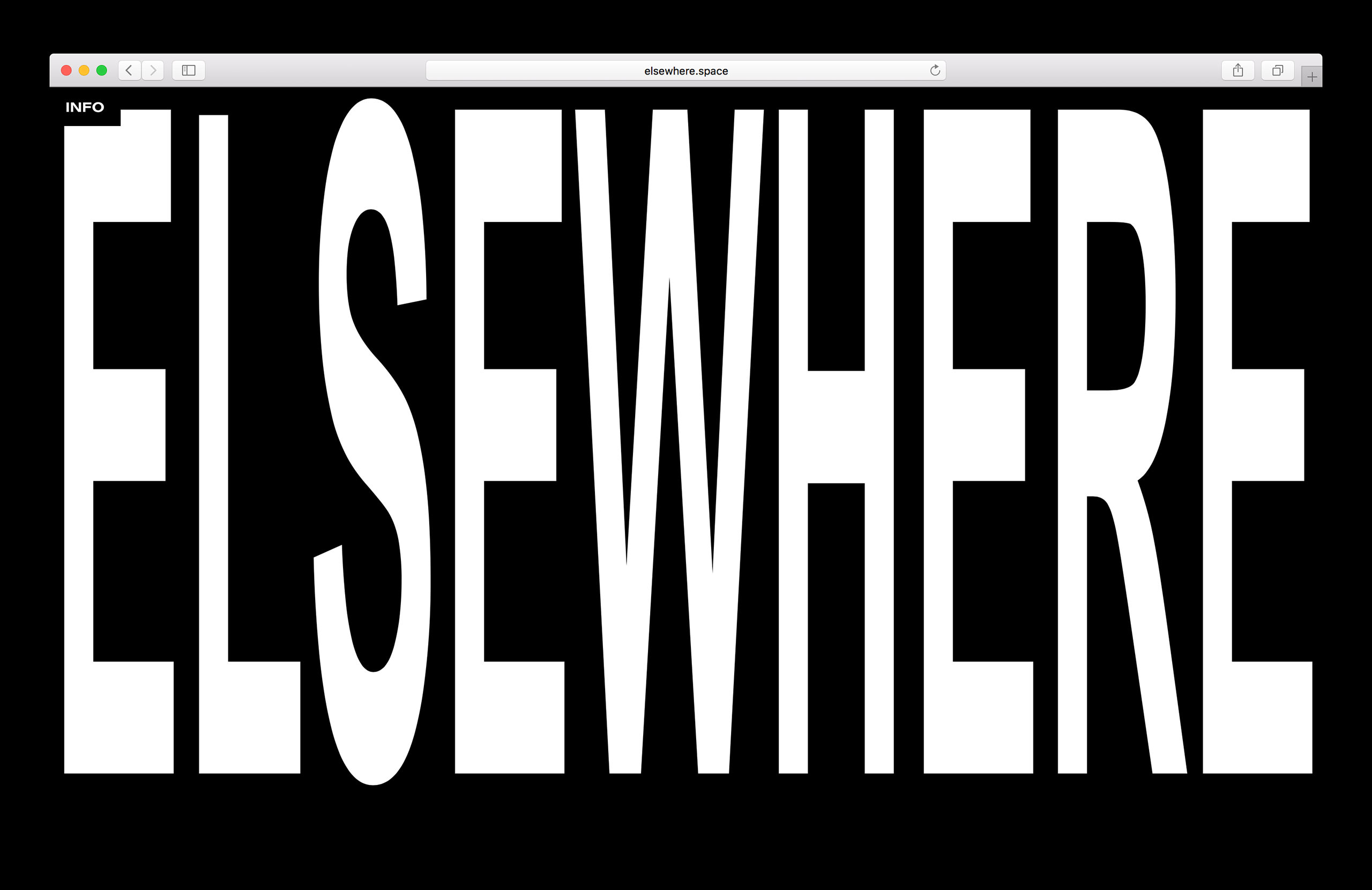
ElsewhereLink
Visual Identity, Front-end Development, Website
As browsers get faster and more sophisticated, the opportunities for web-based, interactive typography grows. Elsewhere was created as a digital sketchbook to explore these ideas. The site is best viewed in the latest version of Chrome.
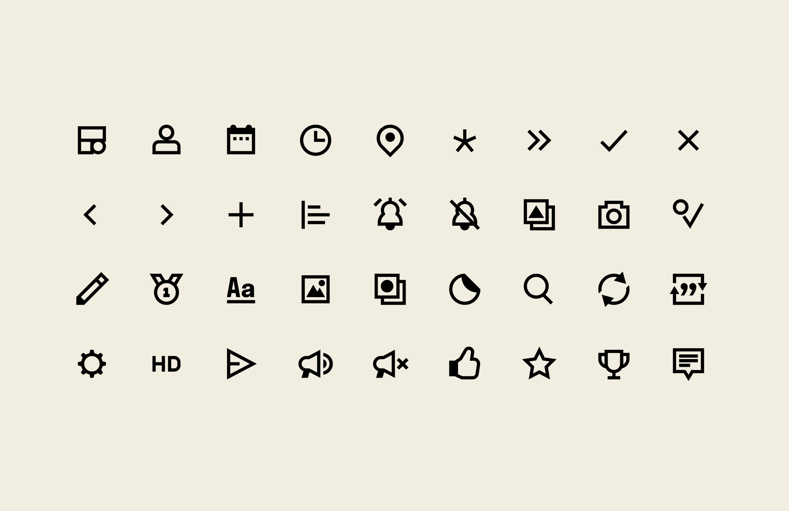
Businessweek Icons
Icon design
I worked with Commercial Type to create an icon set for Bloomberg Businessweek to be used across their magazine and website. The icons are designed to work as individual graphics for maps and infographics as well as being used inline with their custom cut of Neue Haas Grotesk. AD by Greg Gazdowicz and Paul Barnes.
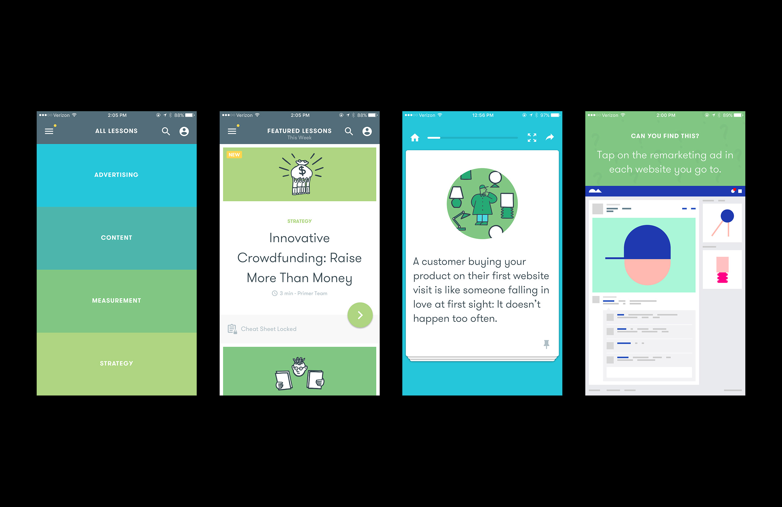
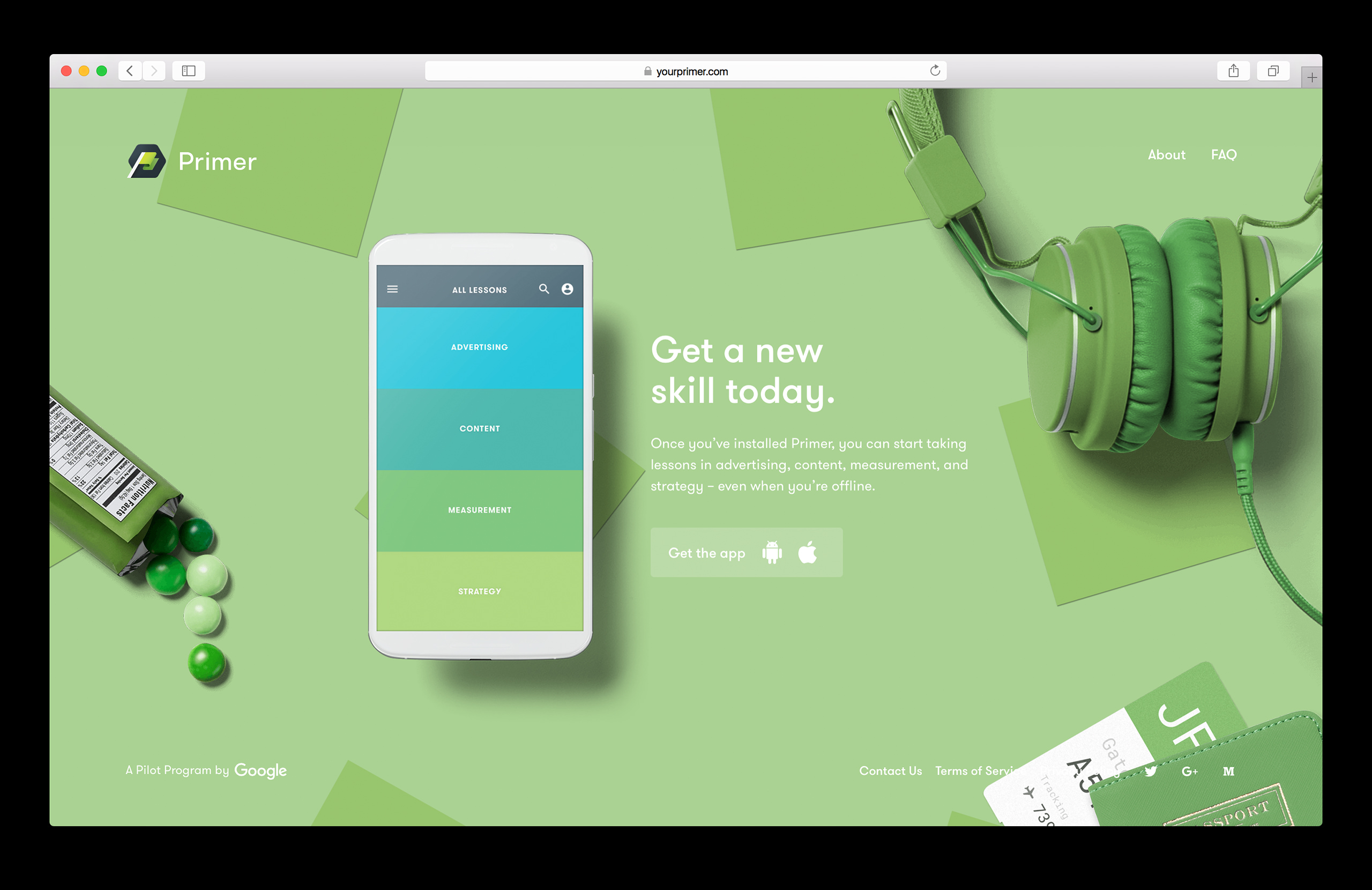
Google PrimerLink
Product Design, Website, Art Direction
Primer is a mobile app from Google that teaches digital marketing skills in bite-sized lessons that can be done whenever you have 5 minutes free. In addition to the mobile app, I worked on the design and art direction of the website that extends the metaphor of being able to fit a lesson in anywhere.
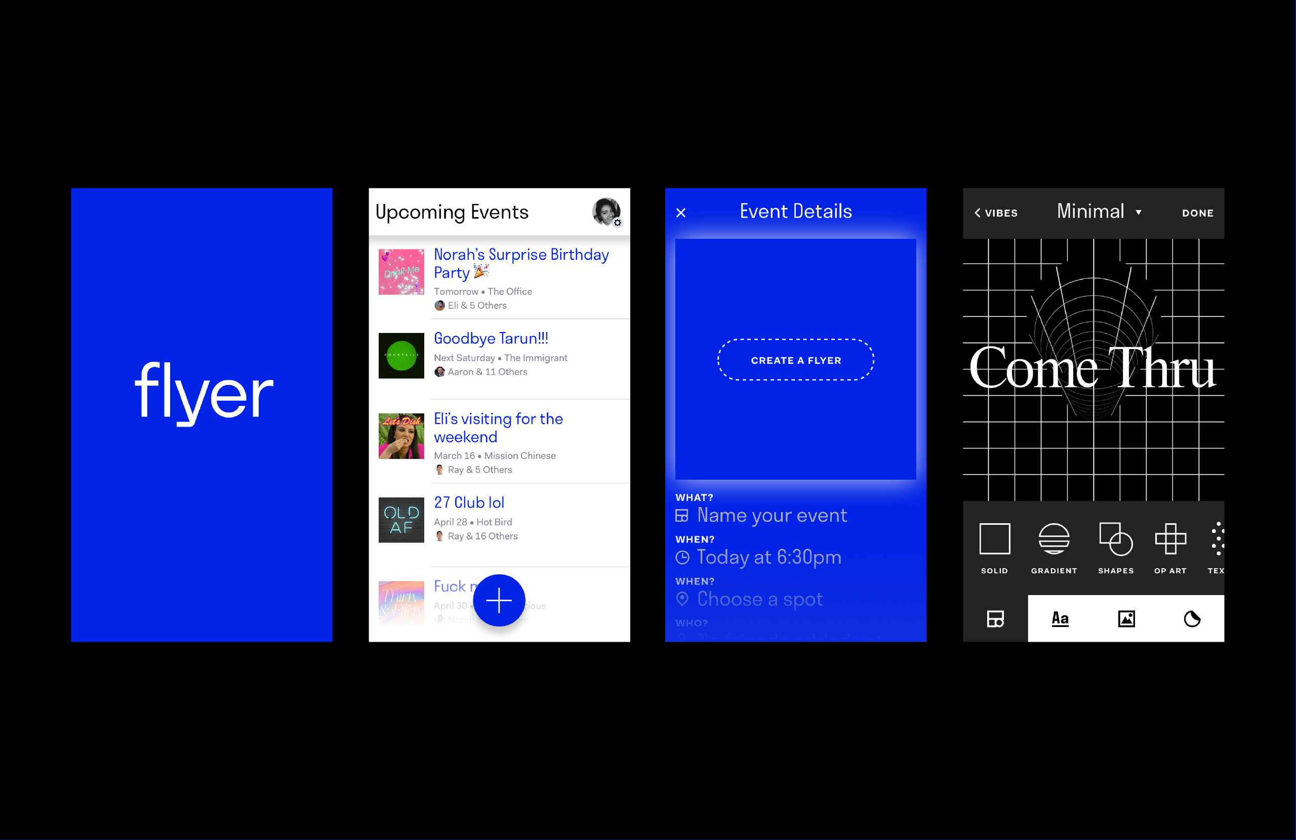
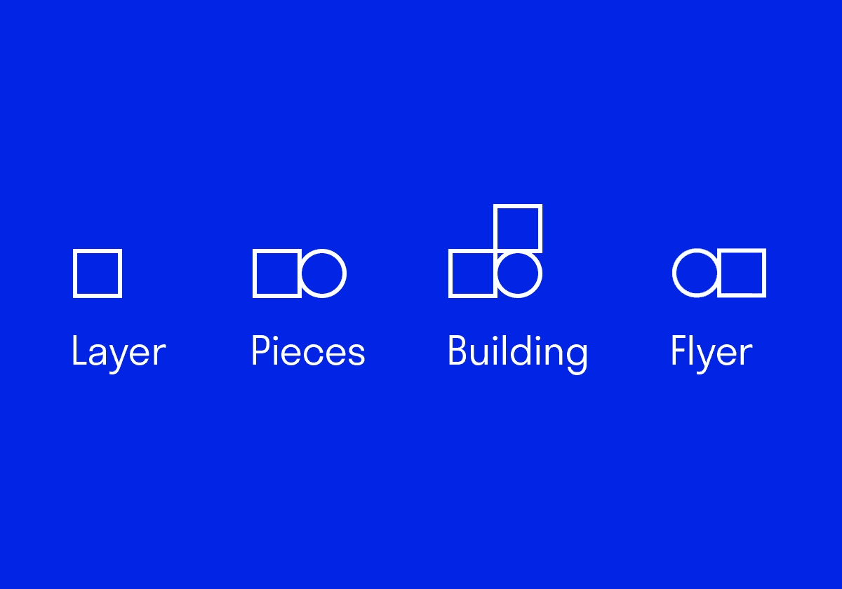
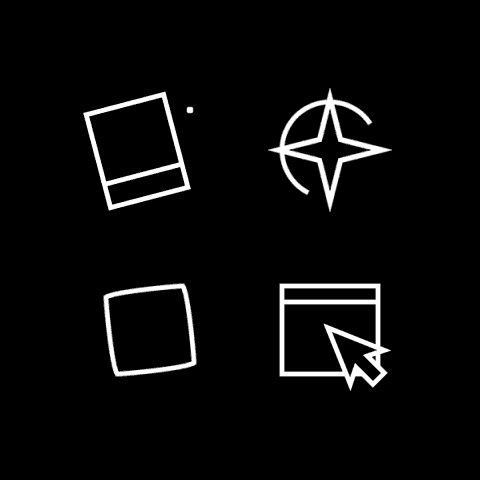
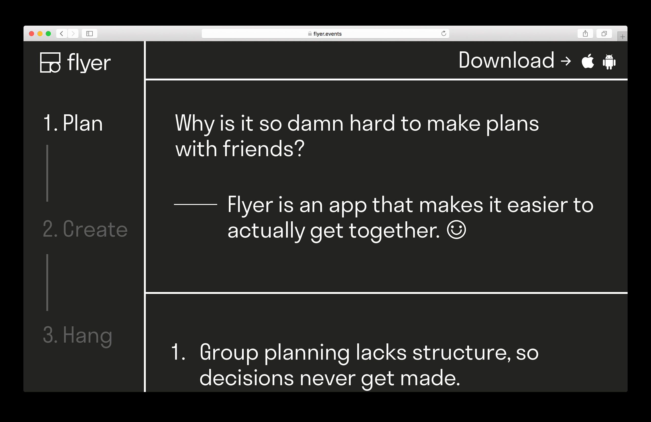
Flyer
Naming, Visual Identity, Art Direction, Content, Motion
I spent a year developing the brand, content, and art direction for Flyer, a new mobile events product. The primary use case was for casual get-togethers with friends, and the design and art direction focused on simplicity and slight irreverence.
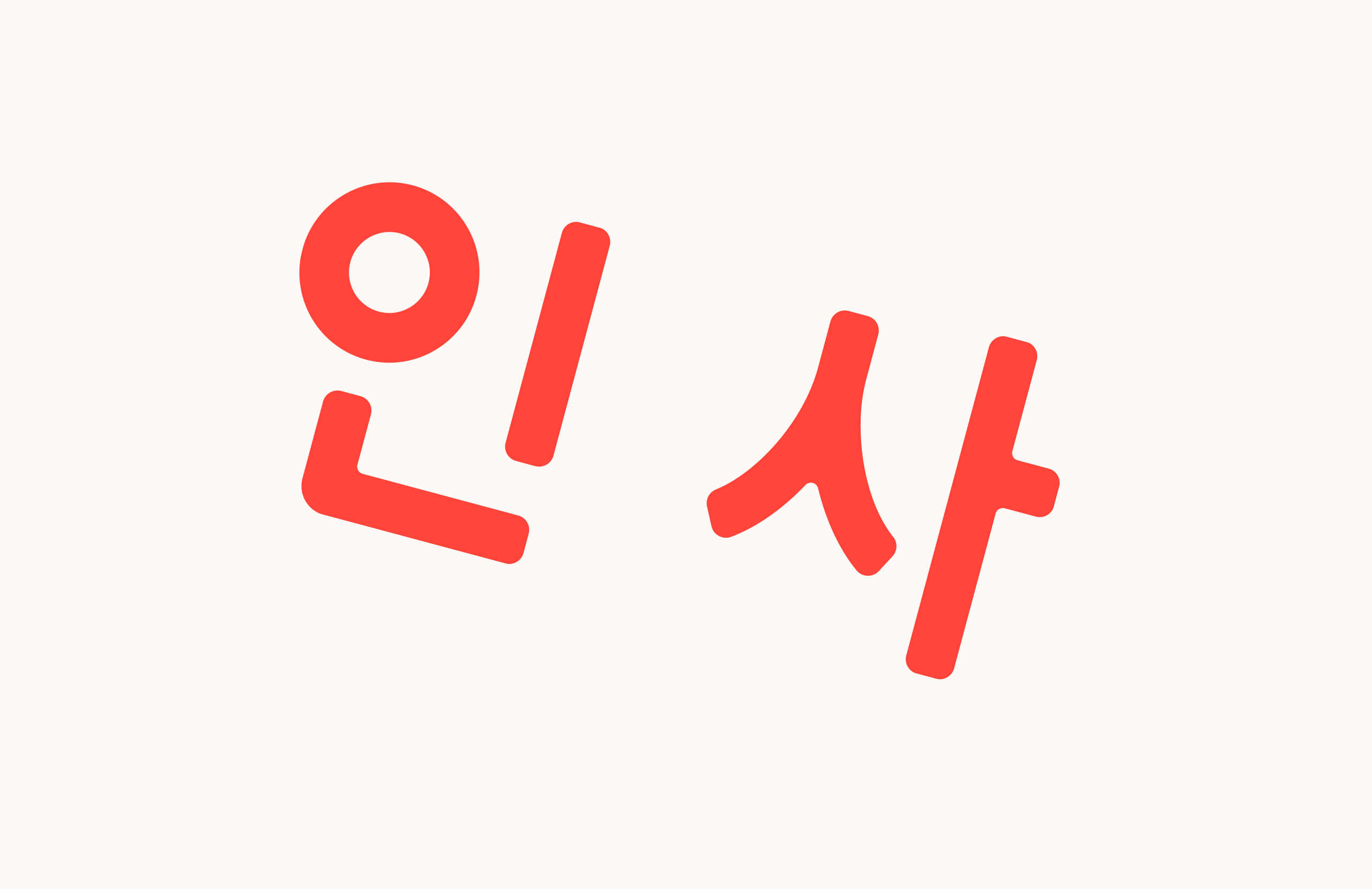
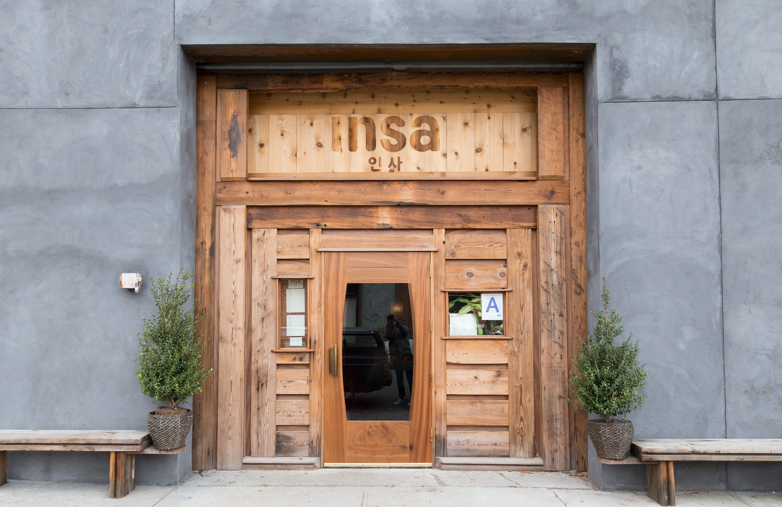
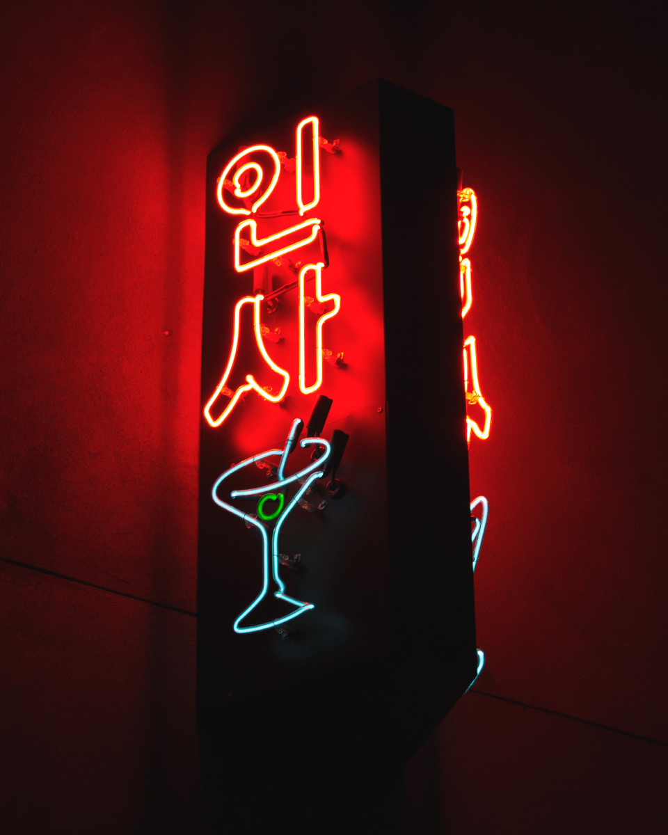
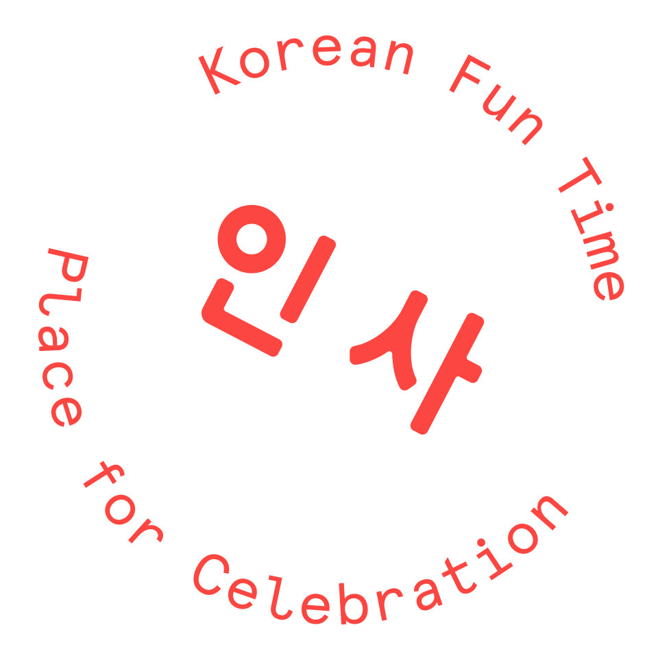
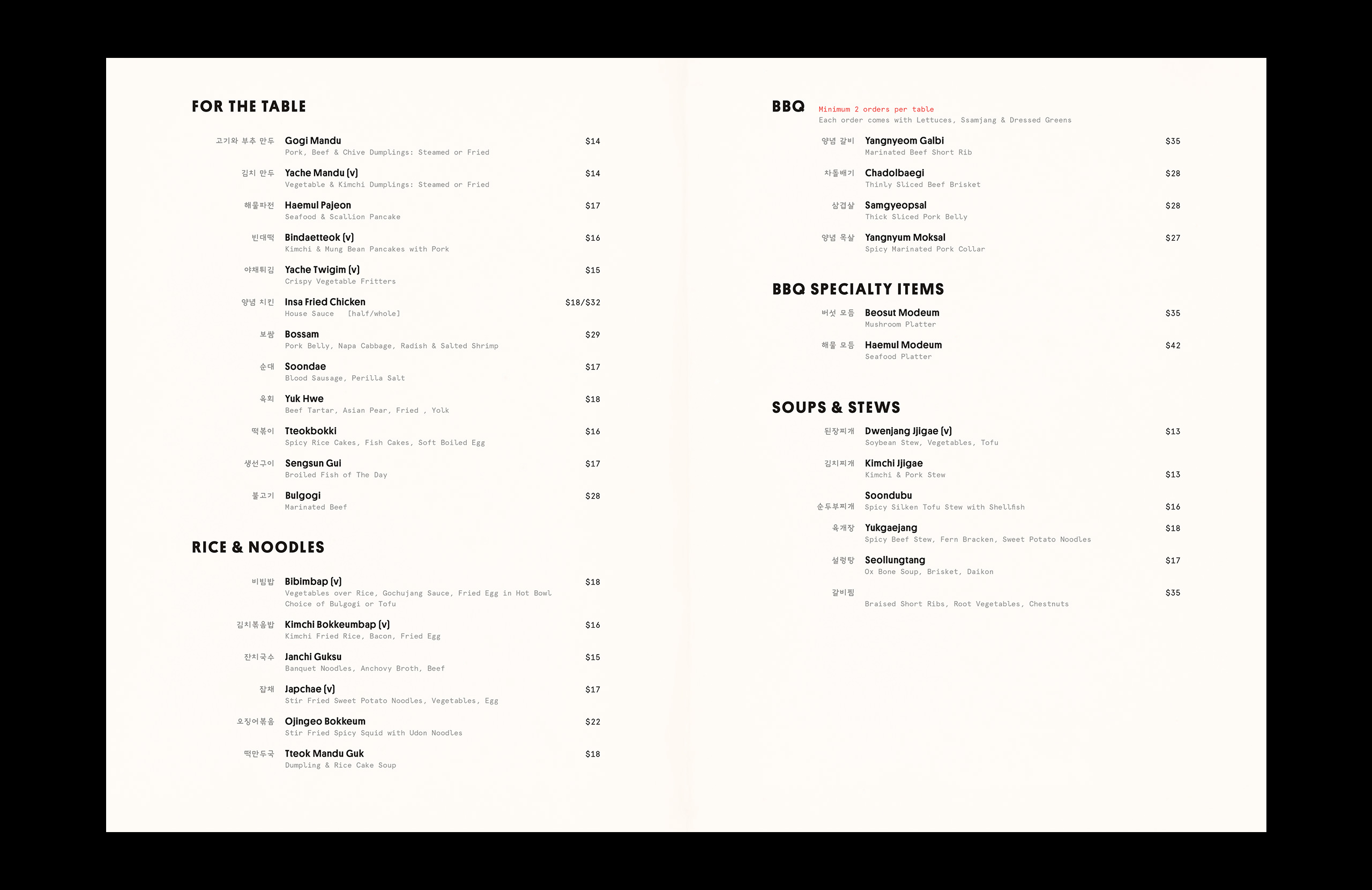
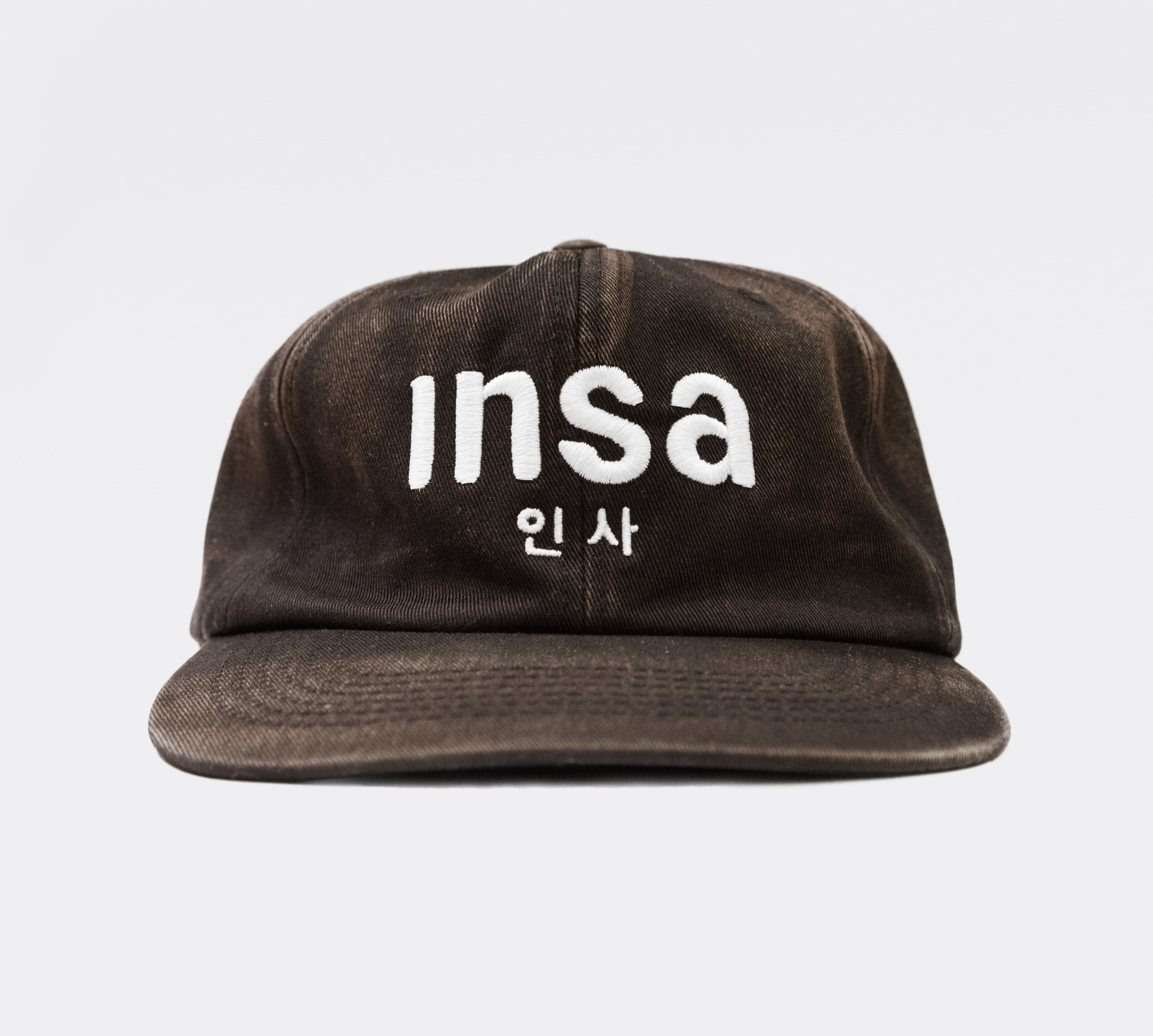
Insa
Visual Identity, Print Collateral
Insa is a restaurant and karaoke lounge located in Gowanus, Brooklyn from chef, Sohui Kim, that serves authentic Korean cuisine. The goal was to create an identity that speaks to the restaurant’s unique heritage, while also finding the balance between humble and contemporary.
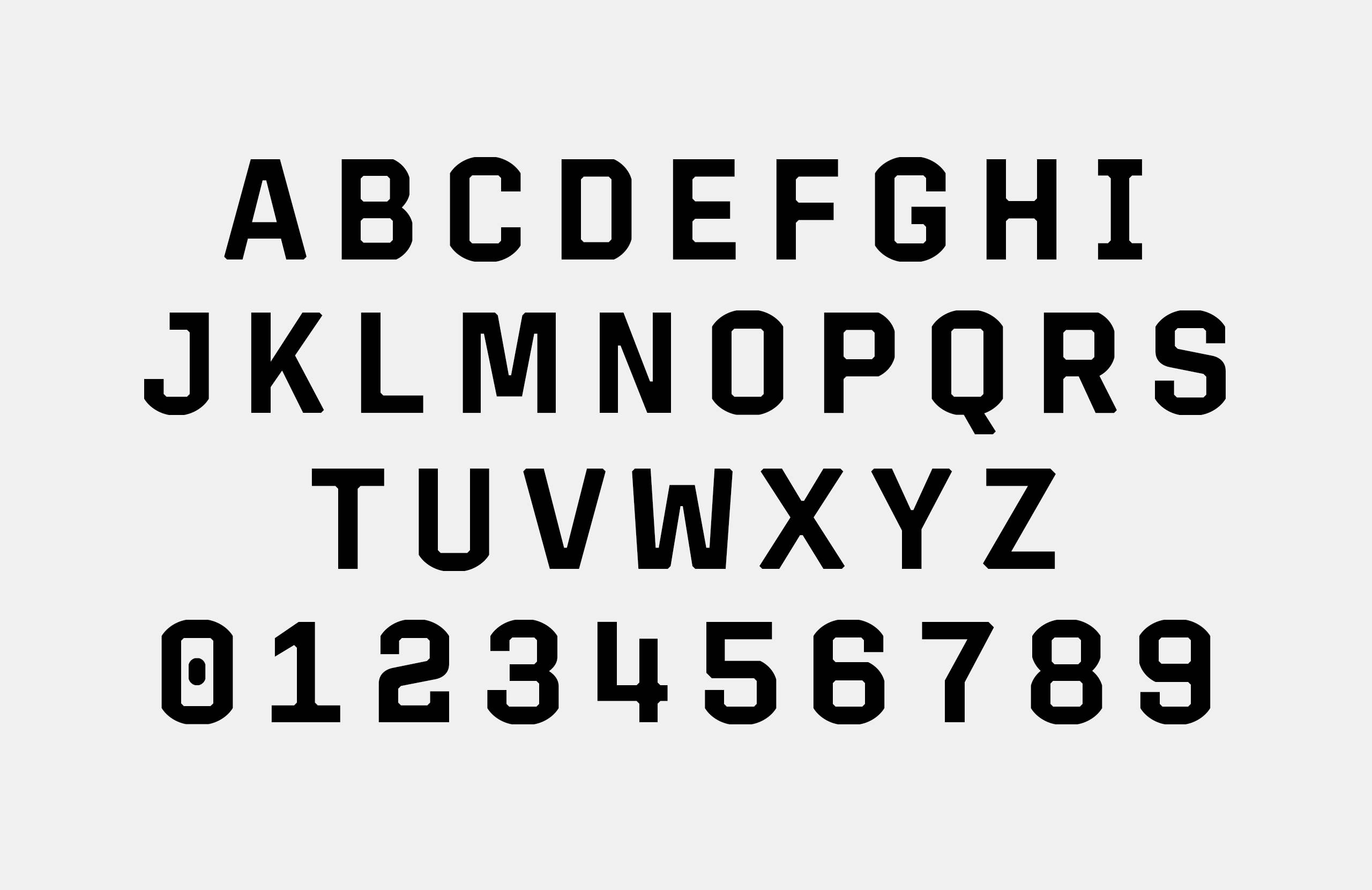
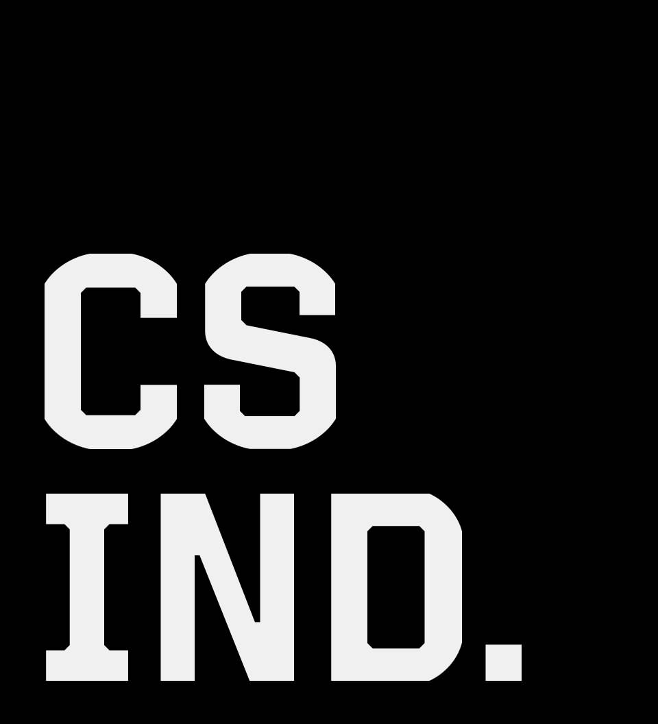
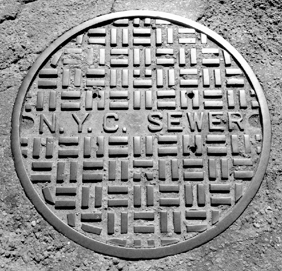
CS IndustriesLink
Visual Identity, Custom Typeface, Website
CS Industries is a brand strategy firm in New York City with experience in creative development as well as manufacturing and sourcing for custom products. For their identity, I created a custom typeface inspired by the welded metal letterforms often seen on New York City sewer covers.
Thanks for looking.
—Ray